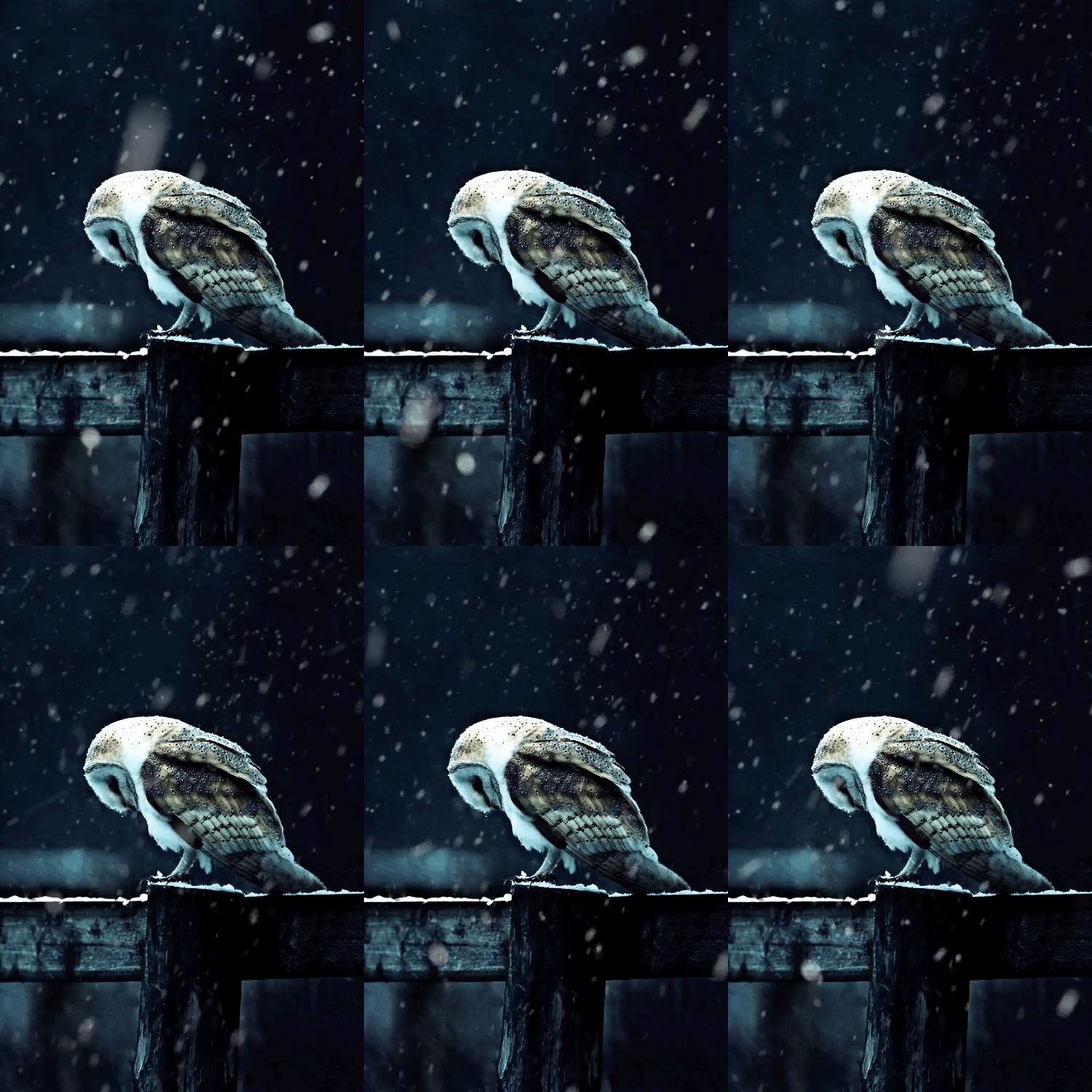
Option 3!

3 because I think the colors go well together and I feel like 1 is to predictable

I like the option 1 because of the more warm colours at the bottom, which to me signify a sense of hope, Personally I wud suggest to use all warm colours (yellow,orange,brown,green) and use very little blue's,whites and associated variants
Seeing warm colours reminds me of hope, happiness, fulfilment, friendship, family, faith, victory, warmth of love, togetherness........................................................................................
Its been decided numero tres porfavor. No brainer
@Laura
Option 3 because the colours are relaxing and warm
I like option 1 because the colours used in it inspire me hope

I like Option 1 best because it has that warm calmness that I really enjoy
I like options 1 and 3. The first one is bright and cheery, a natural sunrise or sunset. The third is my favorite color combination, which I find calming and soothing.
1 or 3
1 has colour nutural and is very inviting and very happy and cherry looking.
3 looks kind of like a girly thing and a lot of guys will turn that away. but it's very welcoming and the colours are calming to someone who needs it.

option 1 or 2 look best to me :) the colors are very calm and inviting! especially option 1.