New Member Dashboard / Feed is Live!

Quick update - the new dashboard or feed is live for half of our members. This is something that is called an a/b test. We compare how two groups use the dashboard to better learn how it is being used and whether or not it is helpful. If you are not in the group that has the new dashboard, then just hang tight and you'll experience it in the coming weeks. We are using this time to continue to iterate on it. You all were very helpful when we reviewed the designs and updated it from the original to the latest version. This testing continues along those same lines. We will release a new dashboard for listeners soon.
If you do have access, and you are willing to share, then I'd love to hear your 3 words to describe it. I'll start!
-welcoming
-hopeful
-alive

@GlenM
Thank you for the opportunity to test out the new dashboard/feed. I really like what's been done to it.
-Modern
-Convenient
-Compelling
@CosmicArtemis
Although, if I could suggest one thing, it would be that the growth path stays at the top of the feed.
@CosmicArtemis thank you!
@CosmicArtemis thank you! Can you describe compelling more?
@GlenM
Sure thing :) I find it very interesting and attention grabbing. Aesthetically pleasing. Also effective at showing more of what is available. Captivated me immediately and I admire the work that's been put into it!

@GlenM
Overwhelming
Awkward
Convenient
@BackpackerGreta can you share more on overwhelming and awkward? would love to have a better understanding of what is making it feel that way. thank you!
@GlenM
Thank you for all that you do on the website and for asking more about my experience with the update. My understanding is that this is the member's side of things. While I don't want to come off as overly negative, I feel as though it's important to voice my concerns, especially when it can get overlooked by positive oriented comments.
I would say it looks awkward because of the colors. The light gray background and the white everywhere else is hard on my eyes both in terms of style and brightness. It would be cool to have customization or at the very least a dark mode to make it easier on my eyes, where part of the background is a darker color like black. The blue banner on top looks okay the way it is.
It is overwhelming because there are so many options all in one page that I'm not sure what to do with. Most of them are for things I don't want to see or use and wish things were kept simpler. I think it would be satisfying to have an option to hide some of the tabs and modules. It would be extra cool to be able to modify the dimensions of the white shapes that contain the options and move them around the page. Things feel very cluttered between the chats, the forums, the community calendar etc. And while the drop down menus are nice, there's a lot of sliding movements on the right side that toggle which makes me look over to that side too much.
I think this is a great step in the right direction and appreciate the modern look as well as the work that's put into this platform. I hope things continue improving from here on out.

@GlenM
Hey Glen, I'm loving the new member dashboard!! My words to describe it are:
Compact: I really love that things such as stats, etc. are right at a glance just by rolling over the icons (instead of additional wasted screen space)
Informative: I love that it shows what group chats are going on right now (and <3 that it shows the topic and how much longer they are open). Also <3<3 the Community Calendar preview so we can see what is coming up soon!
Interactive: I can see the most recent posts, or posts like games, introductions , etc. that encourage people to jump in and join.
In short, the new dash is Swweetttt and I can't wait for the Listeners to get it too :)
@Shipp awesome and comprehensive feedback. thank you! that is exactly what we were going for :)

I really liked the new dashboard, it has a feed of all the forum posts, which will now be read more as opposed to the push notifications, and the group chats, and finding listener options are nice too, it helps in sending people to exactly where they need to go, overall UI is smooth.. ❤️
Suggestions since it's in testing stage:
1) Add the growth paths menu to the list, where a person can be directed to categories of the growth paths and can choose one as per their liking, it will also help the path builders in H Prize projects.
2) Find a group leads to only the active discussions, which is nice as we needed more awareness on them, but I would also like a list of the group categories with them so as to help newbie members to find their room where they relate the most.
Love the design work, every lil bit even small logos are worked on, I can see the efforts of the web designer team, would love to see this site progress more! ☺️
@mickey2100 thank you for this actionable feedback. I'll share with the team. Stay tuned!

This is from a perspective of using the site on mobile (but not the app).
-incomplete
-overwhelming
-unfriendly
What I mean by this:
-it's missing the chat list? I can start a new chat, but can't see my current chats. I also think it would be better to have the bottom section to have stayed the same, for example, I'd never know where to go for the "support & feedback" link, I only know it at the bottom of the page. It's still there on other pages, but would be nice to have it consistent across all pages (including the dash).
-I'm not a fan of the endless-scroll setup, it gets to be too much. And, I'm concerned about seeing random posts from places I wouldn't normally want to see, that are triggering, especially since you can now see more than just the title. I liked the option to only go into forums I wanted to see, and can choose not to see certain ones at all if I didn't want to.
-unfriendly, most just not very user-friendly, due to the aforementioned things. Having no "bottom of the page" feels strange. I don't know where to look for some things I'd want to use, and am cluttered with things I will never use. It's also a bit strange that there's one forum post, then the growth path, then the rest of the forum posts?

just a little feedback after using it for a while! it doesn't really self update, so it'll show 2 replies and not the 10 it is, or whatnot. not the best setup, but that's alright!

i really like how modern it looks. it's an improvement from the old version.
while looking through the changes, i noticed, there's a bug on the growth path with "<div></div>".
i also noticed that when going from the dashboard -> chat -> groups -> see all chats, it opens to 1-on-1 chat first, which might be correct, but it does feel a bit awkward.
here's the bug within the growth path: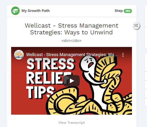

I wasn't going to respond as I find people prefer hearing what others like, but here are my 3 words:
Juvenile - It feels designed for children not adults, especially with the images used for "chat with therapist" or "talk to a listener". In fact, I just tested out a screenshot and edited basic blue with chat bubble or similar icons over those two images and it no longer felt juvenile. It's amazing how much even small details can matter.
Sub-Optimized - The layout feels like it doesn't make the best use of the available space, and the main area is devoted to posts and such that are not relevant to me and finding the things I am seeking which are relevant takes more effort, it would be nice to be able to pin certain progress path steps as reminders for example. I have also noticed at present the username wraps, which can be a tad annoying particularly when there is so much empty space around it. Though I will say I do appreciate that the calendar is now featured, I almost wonder if the 'chat with a listener, therapist and calendar' couldn't all be down the right, sort of site level stuff, and then the username/personal info and chats' down the left as that's more a member's personal interaction with cups.
Disheartening - Between the fact that it feels designed for children, and gives me lots of what I don't want and forces me to search for what I do, it somewhat feels like it is implying that having mental health issues or struggles means I'm not an adult and don't know what's good for me/important to me.
My apologies, I know I tend to be heavy on the critique and light on praise, it does seem like a good base that could be even better with little improvements.

Can someone please share the before and after images of the dashboard ? I haven't been online in a while and would like to see what all has changed 😅
Would like to also know if , the layout similar in Tablet /iPads/ mobile devices and PC's / laptops ?
Your replies would be appreciated 💛

Confusing - Many different things are confusing. The notifications, it seems to give me a count of what are actually tags/upvotes/new posts to subscribed threads, and not things like notifications that someone decided to send out to everyone. I prefer this if so, but it took me a while to figure this out and I'm not certain yet. I missed how to actually go to them, may pick that up later.
I think the forum posts are all the new posts - if so yay! This is a feature that I was missing. Again though, this isn't clear, there was mention it will be more personalized over time so I'm not sure this will 'stick' and they aren't all together. I'm also not entirely sure I'm correct these are the most recent forum posts.
The right hand corner pops up and down a bit, I can't actually read everything that can come up as when I scroll a little bit to see the bottom the entire thing disappears. Ie. the track explains cuts out as track, with just one and I can't see anything below that. One what? The scrolling on the right is weird in general. Ie. I want to go to the community calendar, I click to view it. I can see the top 2 things. I scroll down, I see the 3rd and the link. I want to view the top 2 again, it's a lot of scrolling (more than earlier) to get up to see them.
The growth path comes up numerous times between forum posts which reduces the overall flow.
Find a group chat I thought would actually take me to all the group chats. Instead, it opens a pop up window of current discussions.
Lacking - I was hoping for a one stop place for where I want to go. There is still no way to get to the forum homepage directly. The Q&As do appear under quick links, but one really has to know what they are looking for' About Us isn't an obvious place to look IMO. The progress bar for roles is gone and I actually don't know where I can find this at all now - would appreciate that info being shared if someone does know. There is still no update to Member Levels, not a big deal, but kind of annoying it's featured at the top when there is no progress possible.
Redundant - Group chats are accessible on the left and right. Mentioned above, the growth path step keeps repeating. * Note - now seeing how the group chats work trying from both the right and left I wouldn't use this as my 3rd word but it was actually the 2nd that came to mind before I had clicked around, even before seeing this thread.
There are things I like too, they just don't really come up as a specific word. I like being able to jump to a specific group chat or a specific 1-1 chat (although I thought we weren't going to have any of the chat details there due to confidentiality, not a big deal to me but understandable others do not want it there). I like that the calendar is there. If this will be permanent access to forum new posts I really like that. I like that it's labelled home, which is clear. I like the roll over icons for streak, compassion hearts, etc. if the scrolling issue gets fixed.
I think there's a lot that could be included. Some mentioned above - Forum Main Page direct link, Q&A placed in a more obvious spot, the role tracking bar, not yet mentioned badges provide a link to view what badges I have (bonus, make it a well organized page, not just my mess on the profile page). Make it easier to go to all group chats, currently, I can go directly to 3. If I click see all chats (when already using the group chat tab), it takes me to 1-1, not group. Say I want the 24/7 room, it takes me 5 clicks to get there using the group chats on the left. On the right it takes 3, but I have to enter the sharing circle chat room to get there, not always desired.
@AffyAvo It needs to read code properly., Someone upvoted my above post and under notifications this is what I see: